Form fields
- Text input fields
- Labels and helper text
- Form validation
- Checkboxes and radio buttons
- Dropdowns
- Range sliders
This page covers use cases, specs, accessibility and responsive considerations for major form field UI components.
In general, forms should be as simple and direct as possible to minimize scrolling (think mobile first). Keep your queries to a minimum, and ask only what is absolutely needed. Make inputs as self-explanatory as possible, with a minimum of helper text.
Repository
-
cf-forms
Forms in the Capital Framework
Text Input FieldsView code
Usability
Consider matching text input field lengths to the information requested so that users can quickly grasp what is being asked. It’s hard to understand at a glance that a single 1000-px-wide text field is asking for your phone number. A better affordance is three short text fields for area code, prefix and last four digits.
Responsive design
As the viewport resizes to smaller breakpoints, stack and snap text input fields to 100% width when inline fields no longer fit into one line.
Accessibility
For screen readers, make sure the tab focus order is correct. Consider the order in which error messages should be read if they fall below the text field.
Default
- Border: 1 px #75787b (Grey)
- Height: 27 px
- Padding: 10px 3px
Focus
- Border: 2 px #0072ce (Pacific Blue)
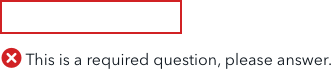
Error
- Border: 2 px #d14124 (Red Orange)
- Error minicon and message should be below the field
Disabled
Limit use. Where possible, use progressive disclosure instead.
- Border: 1 px #babbbd (Grey 50)
- Fill: #f1f2f2 (Gray 10)
Labels and helper textView code
Labels
Form field labels
- H4
- Top aligned
Fieldset legend
Helper text
For screen reader accessibility, consider using the aria-describedby attribute for helper text, which gives users of screen readers the information if they need while allowing more flexibility with placement.
Block helper text
Use block helper text in the following cases:
- To explain why a piece of information is being requested
- To address security and privacy concerns
-
To suggest ways of providing answers other than providing formatting examples
- Font: Avenir Next Regular 14 pt, Dark Grey (#43484e)
- Margin: 10px 0
Inline helper text
Use to indicate whether a field is optional or required (see below).
- Font: Avenir Next Regular 14 pt Dark Grey (#43484e)
Placeholder text
Use placeholder text for formatting examples only.
Don’t use for instructions. Once an input field is focused, the placeholder text is lost.
- Font: Avenir Next Regular 16 pt, #919395 (Grey 80)
Required vs. optional fields
Where possible, design your forms to include required fields only.
Add instructions at the top of the form to clearly indicate that all fields are required unless otherwise noted. If a field is optional, indicate it with inline helper text, as shown here. Don’t indicate which fields are required; that would only introduce redundant visual noise.
Try not to design forms consisting mainly of optional fields. If you must do so, mark required field labels only with inline helper text.
Form validationView code
Where possible, correct formatting errors immediately using client-side validation so that the user does not have to wait until submitting to see what went wrong. (This is especially frustrating if the information the user enters the first time around is not cached on submit and they have to fill out all the fields again from scratch.) If letters are entered in a date field, if an email address is missing the “@” sign, let the user know right away—show a field-level error on blur.
That said, it’s a good idea to always validate on the server side even if you use client-side validation for formatting checks. That’s because JavaScript validation may not work on all clients; JavaScript errors could occur no matter the client; and JS validation can easily be bypassed, which raises security concerns.
In general, the best practice for server-side validation is to mark errors with both form-level AND field-level errors.
Accessibility
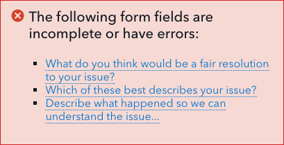
For screen reader accessibility, form-level errors should include anchor links to the problem field in question. See the example below.
In general, use distinct icons, contrasting colors, prominent placement and text to indicate errors. Don’t rely on just one method, as users can have many different accessibility needs (color blind users, visually impaired users, users with motor control issues).
Field-level alerts
Field-level errors
- Use to indicate a problem with a particular field input
Form-level alerts
Form-level errors
Use after validating on the server side to call out input errors preventing form submission
- For screen reader accessibility, include anchor links to the fields that need correction
- Place form-level alerts below the form title
Form-level success
Use to confirm that the form has been successfully submitted

Checkboxes and radio buttonsView code
Checkboxes
Use checkboxes when the user can select more than one option from a list. Make clear with helper text that this is the case.
Usability
To optimize usability, consider using checkboxes with large target areas. If these won’t fit into the design and the default style shown below is used, make sure the target area is at least 45 x 45 px and that it includes the text label.
Accessibility
To optimize screen reader accessibility, lay out checkboxes vertically rather than horizontally.
Default
- 20x20px
- Fill: #FFFFFF
- Border: 1 px, Grey 80 (#919395)

Selected
- Border: 2 px Dark Grey (#43484E)
- Icon: 18px, CFPB Black

Hover
- Border: 2 px Pacific Blue (#0072CE)

Disabled
- Border: 1 px #babbbd (Grey 50)
- Fill: #75787b (Gray)

Radio buttons
Use radio buttons when the user can choose only one option out of a list. Use these for a small number of discrete elements—avoid long lists of radio buttons. When there are more than two options, stack radio buttons vertically.
Usability
Leave radio buttons unselected as the default. It’s easy for users to miss that a radio button has been preselected, and to submit a form with an erroneous answer.
Never use radio buttons for optional questions. Once a radio button is selected from a list, it or another choice must remain selected and there is no going back unless you reload the form.
Consider using radio buttons with large target areas. If these won’t fit into your design and you need to use the default style shown below, make sure the target area is at least 45 x 45 px and includes the option text.
Accessibility
For screen readers, be aware that there are some issues with voiceover reading radio buttons. To get around this, consider using the aria-describedby attribute.
Default
- 20x20px
- Fill: #FFFFFF
- Stroke: 1 px, #919395 (Grey 80)

Selected
- Border: 1 px Pacific Blue (#0072CE)
- Fill: 14x14px, Pacific Blue

Hover
- Border: 2 px Pacific Blue (#0072CE)

Disabled
Where possible, use progressive disclosure instead.
- Border: 1 px #babbbd (Grey 50)
- Fill: #75787b (Gray)

Checkboxes and radio buttons with large target areas
For better usability, consider using checkboxes and radio buttons with large target areas, as shown below. These are easier to interact with and harder to miss. Given the amount of real estate they occupy, they’re probably not suited for use in all cases; for example, they may not work well for terms of service agreement checkboxes.
Default
Background:
- Min-height: 50px
- Fill: #e3e4e5
- Padding: 15px
Radio button:
- 20px x 20px
- Fill: #FFFFFF
- Stroke: 1 px #919395 (Grey 80)

Selected
Background:
- Fill: #cce3f5 (Pacific 20)
- Stroke: 1 or 2 px #a5a7aa (Pacific blue)
Radio button:
- Stroke: 1 px #a5a7aa (Pacific blue)

Hover
Background:
- Fill: #e3e4e5 (Grey 20)
- Stroke: #a5a7aa (Pacific blue)
Radio button:
- Stroke: #a5a7aa (Pacific blue)

DropdownsView code
Easy to implement and cross-browser-friendly, dropdowns can be a good choice in certain circumstances. When the information being requested is likely to be familiar and is usually encountered as a select (e.g. “select your state”, “select your country of residence”), dropdowns are a fine choice. Where possible, place common selects at the top (e.g. the United States for users that are likely to reside there).
Dropdowns should be avoided where the information being presented is likely to be unfamiliar to the user—especially if this information consists of a long list of items. Consider instead alternatives like steppers, inset form elements and progressive disclosure. For short lists, say less than 5 items, radio buttons are also a good choice.
Also keep in mind that dropdowns behave differently on various mobile clients, taking up different amounts of real estate. Mobile also doesn’t allow for the use of typeahead to navigate quickly to an item in a list, so navigating long lists can be especially cumbersome. Again, consider alternatives.
Accessibility
From an accessibility standpoint, browser default multiple select components require the use of a mouse (e.g. holding the control key down and clicking several items). The default components are a poor choice for the visually impaired. If a multi-select component is desired, use custom javascript to make it accessible.
Default
- Height: 27 px
- Border: #babbbd (Grey 50)
- Padding: 15px
- Down caret box: #f1f2f2 (Grey 10)
- Down caret: #919395 (Grey 80)

Hover
- Border: 2 px #0072ce (Pacific Blue)

Disabled
Where possible, use progressive disclosure instead.
Fill: #f1f2f2 (Grey 10)

Range slidersView code
Range sliders can work well for discovery and education, where the inputs are a relative quantity and not a specific numeric input. As an example, users can narrow a list of flight options on kayak.com with sliders that show a range of takeoff times. Sliders are an elegant and intuitive way to allow the user to discover which takeoff times will yield the lowest fares.
Because they’re imprecise and difficult to manipulate, range sliders are not a good choice when the user is likely to have one and only specific number that they will want to input. If you do choose to implement a slider in this latter case, consider adding steppers or an input box as an alternative means of entering the same data. Also consider the balance between the length of the slider and the number of data points it covers (the range as well as how discrete the points are). The more points to choose from, the harder it is for the user to target a specific number.
Accessibility
Make sure that sliders are accessible by keyboard using the arrow keys.
Default
Track:
- Fill: #919395 (Grey 80)
- Stroke: 1 px #BABBBD (Grey 50)
- Height: 9 px
Handle:
- 45 x 45 px
- Fill: #F1F2F2 (Grey 10)
- Stroke: 1 px #BABBBD (Grey 50)

Focus
- Stroke: 2 px #0072ce (Pacific Blue)